Color
Section titled ColorAs a designer I tend to invest a lot of time into the logic that governs the color. For a simple, bare-minimum brand like “hello, yes.” I did not want to invest too much time or effort. So I opted for a simple color scheme.
There are 4 functional color positions in total: Primary (P), Highlight (H), Dark (D) & Accent (A). Their functional position determines their usage in a given application use case, providing a constraint that allows for more creative design choices.
In the end, I couldn’t resist and filled in the gaps by also adding alternative accent colors. I regret nothing.
The System also features a Color-Weight system, making colors subject to lightness-change, based on a fixed decrement of -15%.
Typography
Section titled TypographyI wanted to look just different enough. Current typographical trends are often very endemic to a certain vocabulary. I wanted something inbetween. So I decided to go with a combination of “Work Sans” for heavy but warm headlines and “Poppins” for geometric and pleasent paragraphs. Luckily Google Fonts provides Work Sans as a variable font and includes many open type features.
Illustration & Icons
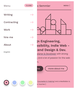
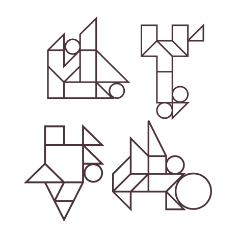
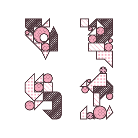
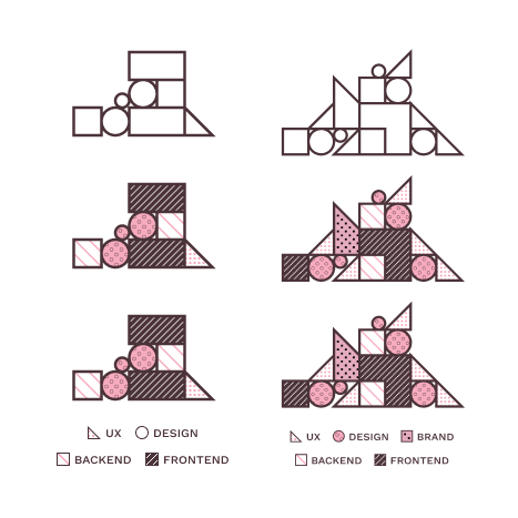
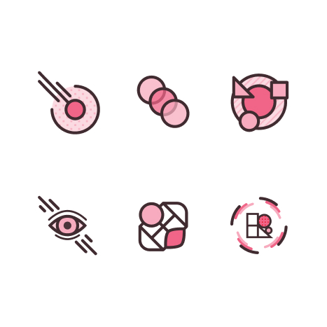
Section titled Illustration & IconsMy drawing skills have rusted since I stopped drawing. But I still like to “illustrate” (lol) with abstract shapes. I loved the idea of using simple shapes that remind of toy building blocks to create abstract compositions.
Later on I decided to also play with different patterns and for a short amount of time, some of the illustrations even served as quasi diagrams.
Website
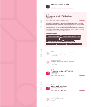
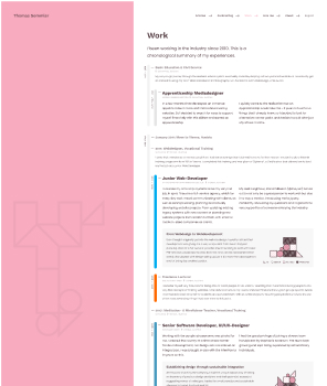
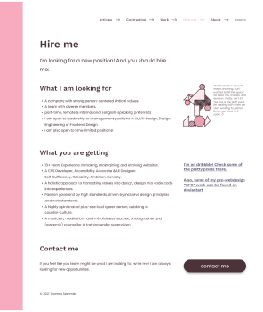
Section titled WebsiteAll of this eventually accumulated on this very website that you are visiting. Here are some... screenshots, lol. But - to legitimize this a bit, some of them are of older versions of the website.