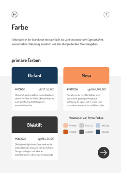
Color
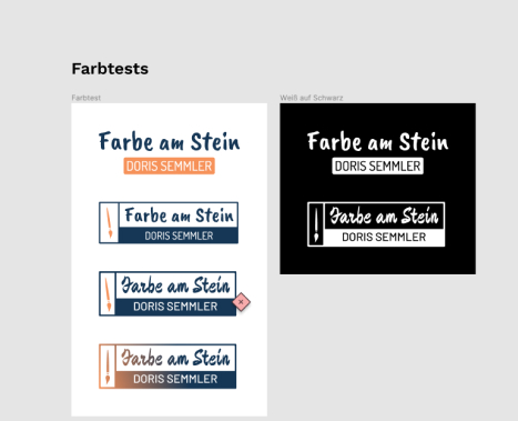
Section titled ColorThe client had specific preferences - so we started out with a combination of orange and a dark blue. This is still the main Scheme, but there are three secondary colors thought of, intended for future use.
Business Cards
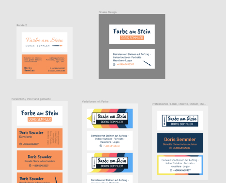
Section titled Business CardsThrough an iterative Approach we were able to conclude with a Combination of “Dosis” and “Caveat Brush” for the business cards and the brand. They have a bit of an unusual format and feature rounded corners.


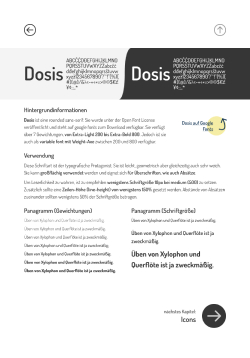
Brand Manual
Section titled Brand ManualA Brand Manual was created to encapsulate and convey the usage of the visual brand, to ensure consistency.
Process Examples
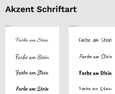
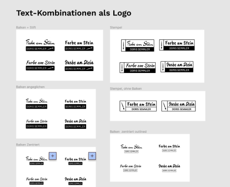
Section titled Process ExamplesThe Process was noteworthy, because the client was very involved in different stages. I made a conscious effort to always provide a lot of choice. Here are some screenshots of the process from the rough sketch to the final product.